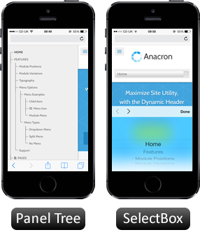
Inside Anacron Template
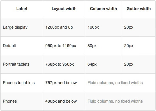
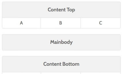
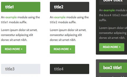
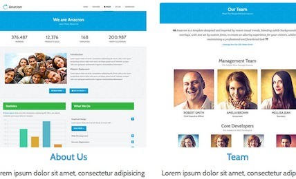
The next generation layout and structure compliments the beautiful and intricate design of the template in conjunction with its many features and integrated extensions


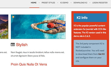
K2 (3rd Party)
Interested? Want to try Anacron?
Download